Spot trends faster, sort smarter: Unlocking Sparklines and Custom Sort in Amazon Quick
Amazon QuickSight, the AWS business intelligence tool, added two dashboard features aimed at non-technical decision makers: sparklines and custom sort for filter controls. Sparklines place a small inline trend line directly inside a table cell so a reader spots direction at a glance without opening a separate chart. Custom sort lets the person building a dashboard set the order of values inside dropdown and list filters instead of relying on default alphabetical order. Both features target teams that want dashboards to follow business logic rather than technical defaults.
Key Takeaways
- Sparklines are compact line or area charts embedded inside table cells, giving a trend view next to each row without a separate chart.
- Sparklines work in table visuals only, not in pivot tables, bar charts, or KPI visuals.
- Custom sort lets dashboard authors order dropdown and list filter values by business priority or a related metric instead of plain alphabetical order.
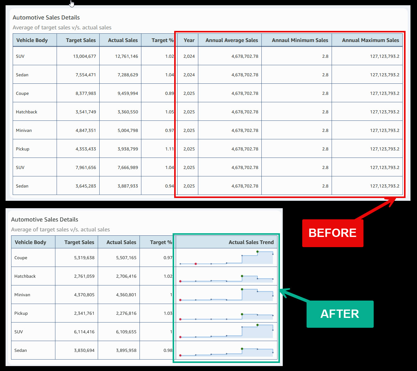
- In a sample sales table, sparklines replaced redundant trend columns and cut the table from eight columns to five.
- A sales rep filter was reordered to show the highest-performing reps at the top using average sales in descending order, so top names appear first.
- Sort settings are fixed by the author at publish time; dashboard readers cannot change the order themselves.
Stats & Key Facts
- #8 columns reduced to 5 columns in the sample sales table after sparklines replaced separate trend columns
- #3 sparklines is the maximum allowed per table visual
- #52 data points is the maximum per individual sparkline
- #3 sort options for manually entered control values: As Entered, Ascending, and Descending
- #2 new capabilities announced together: sparklines and custom sort for controls
Sparklines Put Trend Lines Inside QuickSight Table Cells
Sparklines are small inline charts that sit directly in a table cell.
- ›They render as compact line or area charts embedded within each row of a table.
- ›A reader sees direction, seasonality, and trajectory next to the related number without opening another visual.
- ›They reduce the need for extra columns or a second chart placed beside the table.
- ›They are designed for at-a-glance scanning rather than detailed point-by-point reading.
Where Sparklines Work and the Limits to Plan Around
Sparklines apply to table visuals only and carry specific caps.
- ›Supported in table visuals only, not in pivot tables, bar charts, or KPI visuals.
- ›A table holds up to 3 sparklines, and each sparkline holds up to 52 data points.
- ›The X-axis field cannot match a Group by field, and sparklines cannot share a column with data bars.
- ›Sparklines appear in PDF exports but are dropped from CSV and Excel exports.
- ›The table needs at least one field in Group by and one in the Values field well.
Setting Up a Sparkline Step by Step
Configuration happens in the table format properties pane.
- ›Open the table visual, select the format icon, then choose Apply Sparklines in the Properties pane.
- ›Pick the value column to chart and the X-axis field for the horizontal axis.
- ›Set the Y-axis to Shared for one common scale across rows, or Independent to scale each row on its own.
- ›Choose Line or Area line, set line color, and pick Linear, Smooth, or Stepped interpolation.
- ›Show markers for all points, the maximum value, the minimum value, or none.
Custom Sort Reorders Dropdown and List Filter Controls
Custom sort changes the order of values inside filter controls.
- ›It applies to dropdown and list controls, including single-select and multi-select versions.
- ›Authors replace default alphabetical order with order by business priority or by a related metric.
- ›Values can match a fiscal calendar, an organizational hierarchy, or frequency of use.
- ›Date-type columns are not supported for custom sort.
Two Ways to Define the Sort Order
The order comes either from a manual list or from a dataset column.
For manually entered values, the author opens the Format control pane and picks As Entered to keep a custom order, or Ascending or Descending for alphabetical or numeric order. As Entered is the route for a fixed business sequence the author types in.
For values drawn from a dataset column, the author sorts by the control column itself or by another field, applies an aggregation such as an average, and sets the direction. When specific values and source values are combined, items that cannot be sorted are placed at the end of the list.
Business Scenarios the Announcement Describes
AWS framed both features around sales and finance dashboards.
- ›A vehicle body type sales table dropped from eight columns to five after sparklines absorbed separate trend columns, with markers flagging high and low points.
- ›Finance teams get an in-context view of how figures move over time without building extra charts.
- ›A sales rep dropdown was reordered by average sales descending so the top performers sit at the top of the list.
- ›Fiscal period controls were reordered to match a reporting cycle, placing the latest period first instead of calendar order.
Why This Matters for Non-Technical Dashboard Users
The value is faster reading and less scrolling for business staff.
Both features shift the dashboard toward how a business actually thinks. Sparklines remove the gap between a number and its trend, so a manager sees whether sales are rising or falling in the same row. Custom sort puts the most relevant filter choices where people look first.
One trade-off is worth noting. Sort order is set by the author when the dashboard is published, and readers cannot change it on their own. Teams should agree on the order that serves the most common decision before the dashboard ships.
Frequently Asked Questions
What is a sparkline in Amazon QuickSight?
A sparkline is a small line or area chart embedded inside a table cell. It shows the trend of a value across a dimension, such as months, so a reader sees direction without opening a separate chart.
Which visuals support sparklines?
Sparklines work in table visuals only. They are not available in pivot tables, bar charts, KPI visuals, or other visual types.
How many sparklines and data points are allowed?
A single table supports up to 3 sparklines, and each sparkline supports up to 52 data points.
What does custom sort for controls do?
Custom sort lets a dashboard author set the order of values in dropdown and list filter controls. Instead of default alphabetical order, values can follow business priority, a related metric, or a fiscal calendar.
Can dashboard readers change the custom sort order?
No. The sort order is set by the author at publish time, and dashboard readers cannot modify it themselves.
Sparklines and custom sort give QuickSight authors two simple ways to make dashboards read the way a business thinks, with trends shown in place and filter values ordered by what matters most.
Continue Learning
Comments
Sign in to join the conversation